CASE TYPE 01
Consultants & Advisors
Your work is valuable, but the site makes people work too hard to understand how you help, why your approach matters, and what the next step should be.
A focused website sprint for service-based businesses that need clearer messaging, stronger trust, and a better path from first visit to inquiry.
No full rebuild required. We'll review your site, identify the highest-impact fixes, and tell you which sprint makes sense, if any.
FOR Consultants • Coaches • Advisors • Law firms • Financial professionals • Service-based businesses with an existing website that needs to work harder
Most service websites are not completely broken. The problem is quieter than that.
A visitor lands on the page. They understand some of what you do, but not enough. They see services, but the value feels vague. They see a contact button, but nothing has made the next step feel obvious or worth it.
So they leave.
Not because your business is weak. Because the website did not give them a clear enough reason to trust you, choose you, or start a conversation.
The Website Clarity Sprint™ fixes the parts of the site that make people hesitate before they reach out.
A full website project is not always the right next move.
Sometimes the site already has enough to work with. The problem is that the message is unclear, the homepage is doing too much, the visual direction feels weaker than the business, or the next step is too easy to miss.
You do not need to rebuild every page to make the website more useful. You need to fix the parts that carry the most weight.
The Website Clarity Sprint™ is for businesses where the website does more than share information.
It needs to make people feel confident before they book a call, request a consultation, or compare you with another option.
CASE TYPE 01
Your work is valuable, but the site makes people work too hard to understand how you help, why your approach matters, and what the next step should be.
CASE TYPE 02
Your website needs to make your expertise feel clear, credible, and grounded, so people can understand your approach before they ever speak with you.
CASE TYPE 03
Visitors are often comparing you quietly before they contact you. Your site needs to create confidence before they share their problem or request a consultation.
CASE TYPE 04
Trust matters before the first conversation. Your website needs to explain value clearly, reduce doubt, and make the next step feel safe.
CASE TYPE 05
Your business has matured, but your website still reflects an earlier stage. The sprint helps your site catch up to the level of work you now deliver.
Diagnosis
That's what the website review call is for. We look at the site, identify the highest-impact fix, and recommend the right scope, even if smaller.
People do not read your website like a brochure.
They scan for signals.
They want to know what you do, who it is for, why it matters, whether they can trust you, and what they should do next.
The Website Clarity Sprint™ strengthens those decision points.
Axis 01
We sharpen what the page says, so visitors understand the offer faster and do not have to piece things together on their own.
Axis 02
We improve the order of the page, so each section has a purpose and guides people toward the next step with less friction.
Axis 03
We make proof, positioning, and visual quality more visible, so the website better reflects the value of your work.
Axis 04
We clarify the path to inquiry, so visitors know what to do next and why it is worth taking that step.
The goal is not to change everything. It is to make the right things clearer, stronger, and easier to act on.
The Website Clarity Sprint™ gives your website a sharper plan, clearer communication, and a stronger first impression without turning the project into a full rebuild.
The exact scope depends on the sprint option you choose, but every version starts with the same goal: fix the parts of the site that are most likely to affect trust and inquiries.
We review your current website and identify where visitors may lose clarity, trust, or interest.
Included · all sprints
We define the main message, page goal, section flow, and primary action for the homepage.
Included · all sprints
We refine the key copy that explains what you do, who it is for, why it matters, and what visitors should do next.
Included · all sprints
We organize the page so each section has a job and the visitor does not have to work hard to understand the offer.
Included · all sprints
We redesign the selected page or pages so the site feels clearer, more credible, and easier to use.
Included · all sprints
Depending on your sprint option, we build the approved design in Squarespace or Webflow.
Sprint-dependent
We review what changed, why it changed, and how to use the updated page with more confidence.
Included · all sprints
You get a focused improvement plan, a clearer website direction, and the right level of support to move the site forward.
A few words from clients who trusted Studio FLACH with their website, brand, and business presence.
"Studio FLACH brought creativity, clear thinking, and a human touch to the process. They guided my ideas with real expertise, and I couldn't be happier with my website."
"They were professional, creative, and easy to communicate with. They took feedback well, worked efficiently, and often made my ideas better."
"They listened well, understood the purpose of our site quickly, and translated our needs into a clean, finished direction."
Some websites need a sharper homepage. Others need the homepage redesigned and built. Some need the main pages cleaned up so the whole site feels more credible and easier to use.
The Website Clarity Sprint™ gives you a focused way to improve the site without starting a full website project.
$2,000
For businesses that need a clearer homepage strategy, stronger message, and better visual direction, but do not need us to build the page.
You want a stronger homepage direction that you or your team can build later.
Recommended for most businesses
$3,500
For businesses that want the homepage strategy, message, redesign, and build handled together.
You want the main page fixed and live without turning it into a full website rebuild.
$6,000
For businesses whose homepage is not the only issue and whose main pages need to work better together.
Your website needs a clearer homepage, stronger service pages, and a cleaner contact path across the main site.

Studio FLACH is run by Lucas and Stephanie Flach, a husband-and-wife design team with more than 10 years of experience creating brands and websites for service-based businesses.
We sit between two options many business owners want to avoid: cheap design that only changes the surface, and large agency projects that feel slow, expensive, and hard to control.
With us, strategy, copy direction, design, and build stay close to the same table.
POINT 01
Your website does not need to explain everything. It needs to make the right things clear enough for someone to trust you and take the next step.
POINT 02
Every page needs a job. Before we redesign anything, we look at the message, offer, proof, structure, and contact path.
POINT 03
The sprint is not built to turn into a large project by default. It is built to fix the parts that matter most right now.
POINT 04
You are not passed through layers of account managers. You work with the people shaping the strategy and doing the work.
A few examples of brand and website projects shaped for service-based businesses that needed clearer communication, stronger trust, and a more professional first impression.
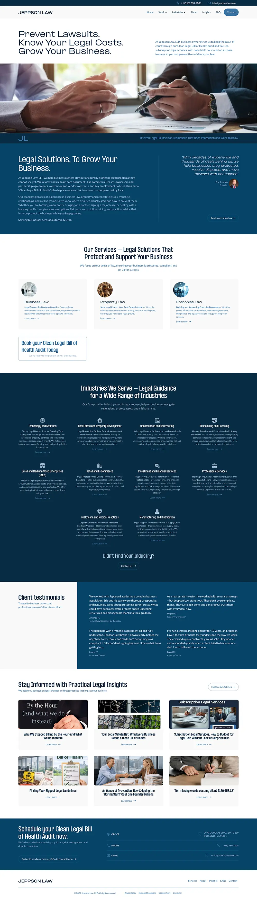
A clearer legal website built around business risk, trust, and action.
We turned a general law firm homepage into a more focused business legal website, with clearer positioning, stronger service structure, more visible proof, and a more specific next step.
“Your most trusted professional” felt generic and did not explain the firm’s business-focused value.
The page led with bios and practice areas instead of the client’s problem.
Key services required more reading and were harder to scan.
The consultation path felt more general and less tied to a specific offer.
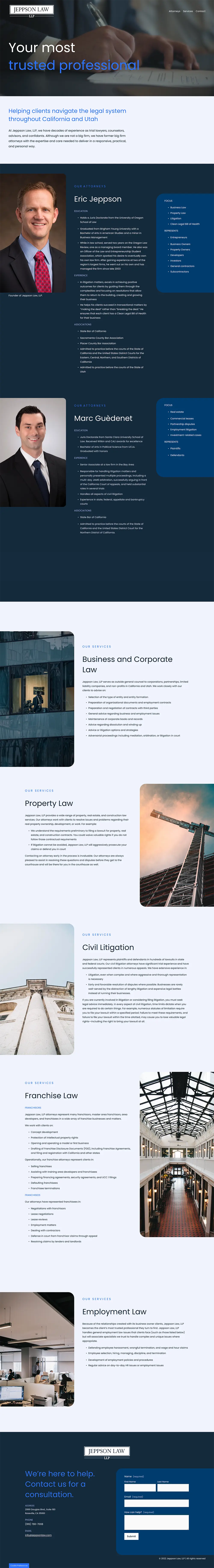
“Prevent Lawsuits. Know Your Legal Costs. Grow Your Business.” speaks directly to business owners and their risks.
The main legal services are easier to scan and compare.
Visitors can quickly see whether the firm works with their type of business.
Testimonials and practical insights build confidence before the consultation.
The “Clean Bill of Health” audit turns the next step into a clear, concrete action.
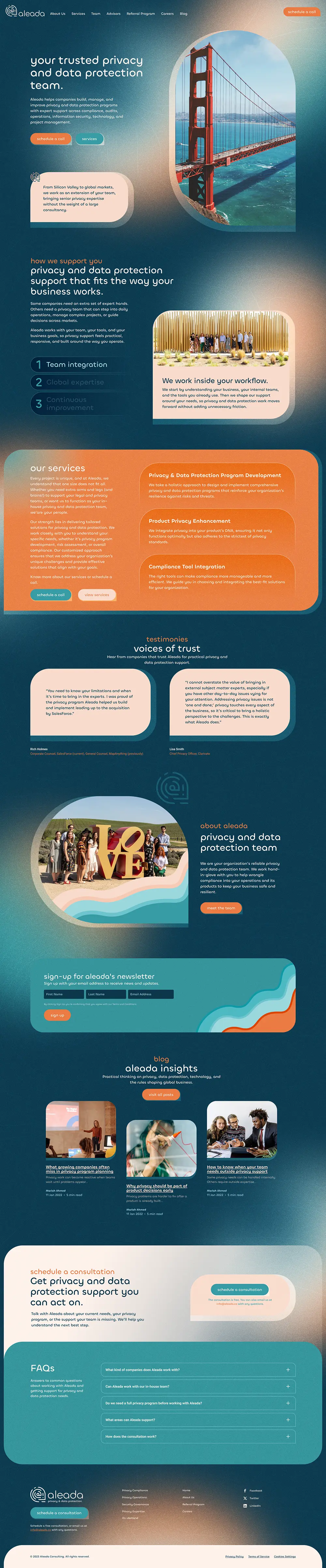
A more distinct consulting website built around privacy, expertise, and trust.
We turned a simple institutional homepage into a more useful privacy and data protection website, with stronger service framing, clearer proof, practical FAQs, and a more natural path to consultation.
The old page introduced the firm, but did not build much value before asking visitors to take action.
The visual identity felt quiet and less memorable for a consulting firm working in privacy and data protection.
The homepage did not make Aleada’s core services easy enough to understand or compare.
Testimonials, expertise, and trust-building content were not placed strongly enough in the visitor journey.
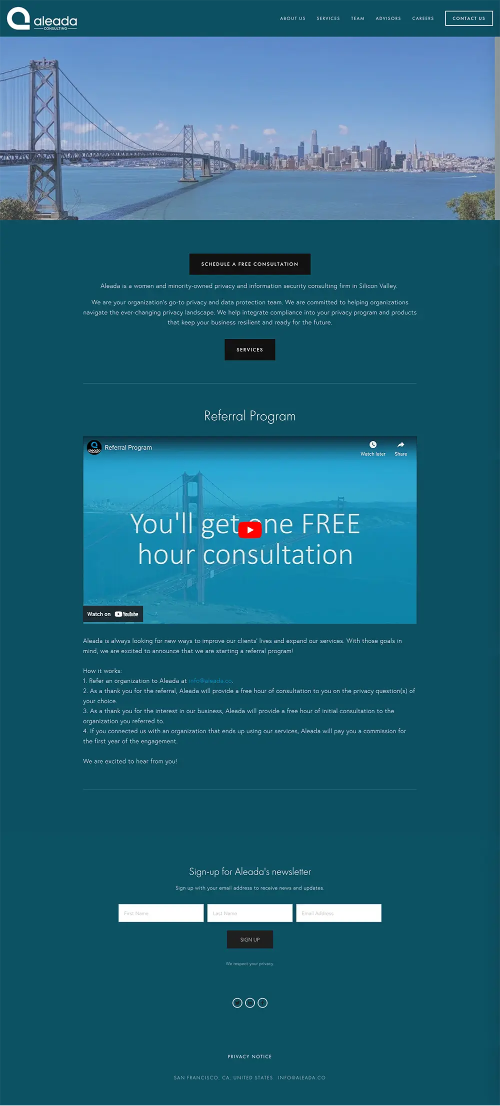
The new hero gives Aleada a clearer position and a more memorable visual presence from the first screen.
The homepage now explains how Aleada supports clients across privacy, data protection, compliance, audits, technology, and daily operations.
Testimonials, blog insights, company context, and FAQs help visitors understand the firm before booking a consultation.
The page gives visitors clearer and more natural paths toward scheduling a consultation.
The FAQ and blog sections replace placeholders with practical questions and topics that speak to real client concerns.
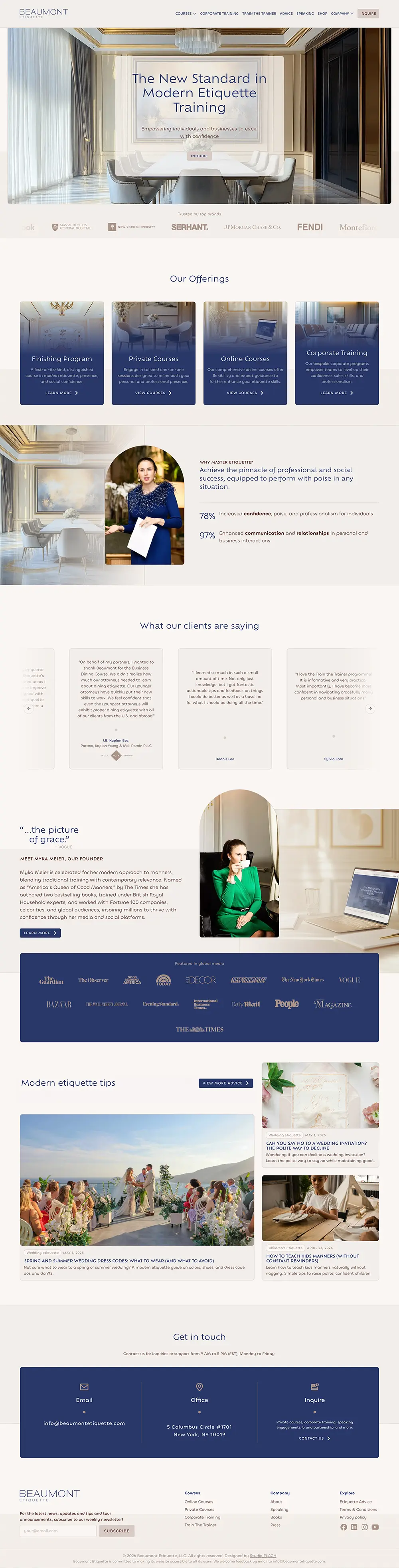
A premium education website built around authority, elegance, and clear program discovery.
We turned an older course-based homepage into a more refined website experience, with clearer program pathways, stronger media proof, richer testimonials, and a smoother path from interest to inquiry.
The old homepage showed several offerings, but it felt more like a general course directory than a guided premium experience.
The design felt lighter, older, and less aligned with the level of polish expected from a modern etiquette training brand.
Courses were visible, but the page did not strongly explain why each path mattered or who each offer was for.
Press logos, the Vogue quote, founder credibility, and brand proof were present, but they did not feel as strong or as well staged as they could.
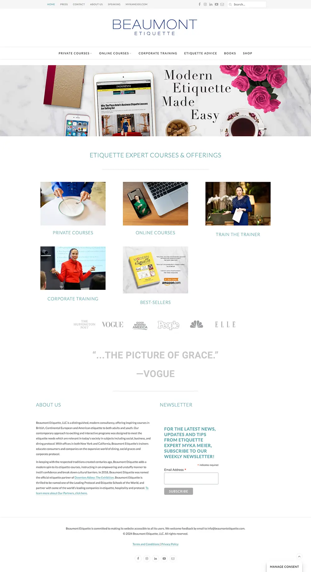
The new hero immediately gives Beaumont a more refined, high-end presence and makes the brand feel more aligned with etiquette, poise, and professional training.
The main programs are easier to scan and compare, helping visitors find the right path faster.
Trusted brand logos, global media mentions, client feedback, and founder credibility are placed with more visual weight.
The page now moves through offerings, benefits, testimonials, founder story, media proof, etiquette tips, and contact in a more guided sequence.
The contact section is clearer and more polished, giving visitors a more natural place to take the next step.
Your website does not need to look like everyone else’s. It needs to make your business easier to understand, trust, and choose.
Book a website review callGood design is not only about how the final website looks. It is also about how clearly the studio understands the business, how well the process is handled, and how confident the client feels when the work is done.
"They nailed my vision. As a professional coach, I wanted my branding to match the level of service I deliver. The result exceeded my expectations. Our website is clean, professional, and extremely stylish."
"They understood what I was trying to achieve and made the website journey feel easy, enjoyable, and exciting."
"The website created was so much better than what I had before. The navigation made everything simple and easy to use."
The Website Clarity Sprint™ is designed to move quickly without skipping the thinking that makes the work useful.
Each step has a clear purpose, so you know what is happening, what we need from you, and how the website is being improved.
We review your current website, offer, audience, and main inquiry path. The goal is to find where visitors may be losing clarity, trust, or interest.
We define the message, page structure, proof points, and next action. This gives the project a clear direction before design begins.
We redesign the selected page or pages so the site feels clearer, more credible, and easier to use.
If your sprint includes build, we bring the approved design into Squarespace or Webflow and prepare it for desktop and mobile.
We review what changed, why it changed, and how to use the updated page going forward.
You get a clear process, a focused scope, and a website improvement that is easier to understand from start to finish.
Most Website Clarity Sprint™ projects take 2 to 4 weeks, depending on the sprint option, feedback speed, platform access, and how much copy needs to be refined.
The sprint keeps the project focused, so you can improve the parts of the website that matter most without opening a long, open-ended redesign project.
2 weeks
Usually the fastest option because it focuses on strategy, structure, copy direction, and visual redesign.
3 weeks
Usually takes a little longer because the approved homepage also needs to be built, checked, and prepared for desktop and mobile.
4 weeks
Usually takes the longest because the main pages need to work together, not just look better on their own.
A few answers to help you understand whether the Website Clarity Sprint™ is the right fit before we talk.
No. This is a focused sprint for the parts of your website that need the most attention.
If your site needs a full rebuild, brand refresh, or larger website project, we’ll tell you during the review process before recommending a smaller scope.
We work best with Webflow and Squarespace, and we can also review or improve sites built on WordPress and other common platforms.
If your site uses a custom or unusual setup, we’ll tell you on the review call whether implementation is in scope or better handled by your developer.
Only for the Homepage Build Sprint™ and Small Website Sprint™.
The Homepage Clarity Sprint™ is delivered as copy, structure, and design documentation that your team can implement. If you want us to help with build afterward, we can discuss that separately.
Yes, for the key website sections included in the sprint.
We refine the message, section copy, service explanations, calls to action, and trust-building parts of the page. If the website needs deeper copywriting across many pages, we’ll price that separately.
Most clients spend about 3 to 5 hours across the sprint.
That usually includes a kickoff call, a strategy or design review, one or two revision rounds, and a final walkthrough. The process is designed to move without pulling you away from your actual work.
That is what the website review call is for.
We’ll look at your current site, identify the highest-impact fix, and recommend the right scope. Sometimes that means a homepage sprint. Sometimes it means a small website sprint. Sometimes it means waiting, fixing something smaller, or starting with a larger project instead.
Yes.
After the review call, we can send a written audit before the proposal is signed. If you read it and decide to stop there, that is a valid outcome. The goal is to help you make a clear decision, not push you into the wrong project.
We’ll say so clearly.
If what you need is a full rebuild, a brand refresh, a more technical project, or nothing urgent at all, we’ll tell you before anything begins and point you toward the next best step.
A clearer homepage. A stronger message. Better proof. A cleaner path to inquiry. That may be enough to help the next visitor understand what you do, trust your business, and take the next step.
We’ll review your site, identify the highest-impact fix, and tell you which Website Clarity Sprint™ option makes the most sense, if any.